Pivot Dashboard Solution
Back in 2021 I was approached by the Director of Procurement where I work, a midsized transit agency called PSTA. We were tasked with an electric bus procurement for the state of Florida. The director asked me for a complicated pivot table where he could select and unselect items on the pricing schedule based on certain vendors. I told him, "Oh I think what you want is a dashboard!" and so I built him one with some pivot table tools.
Link to a copy of the spreadsheet
Link to a Youtube video explaining the spreadsheet to users.
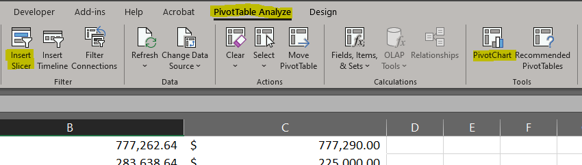
You may or may not already know that when you create a Pivot table a new ribbon appears in Excel. You only need to use two of these tools to create something that functions as dynamic dashboard. See some of the highlights in the below picture. It's not as hard to create as you might think, really all you need is: (1) A pivot table sourced with rich / well structured data. (2) The PivotChart tool from the ribbon highlighted below. (3) The use of Slicers, also available from the ribbon highlighted below
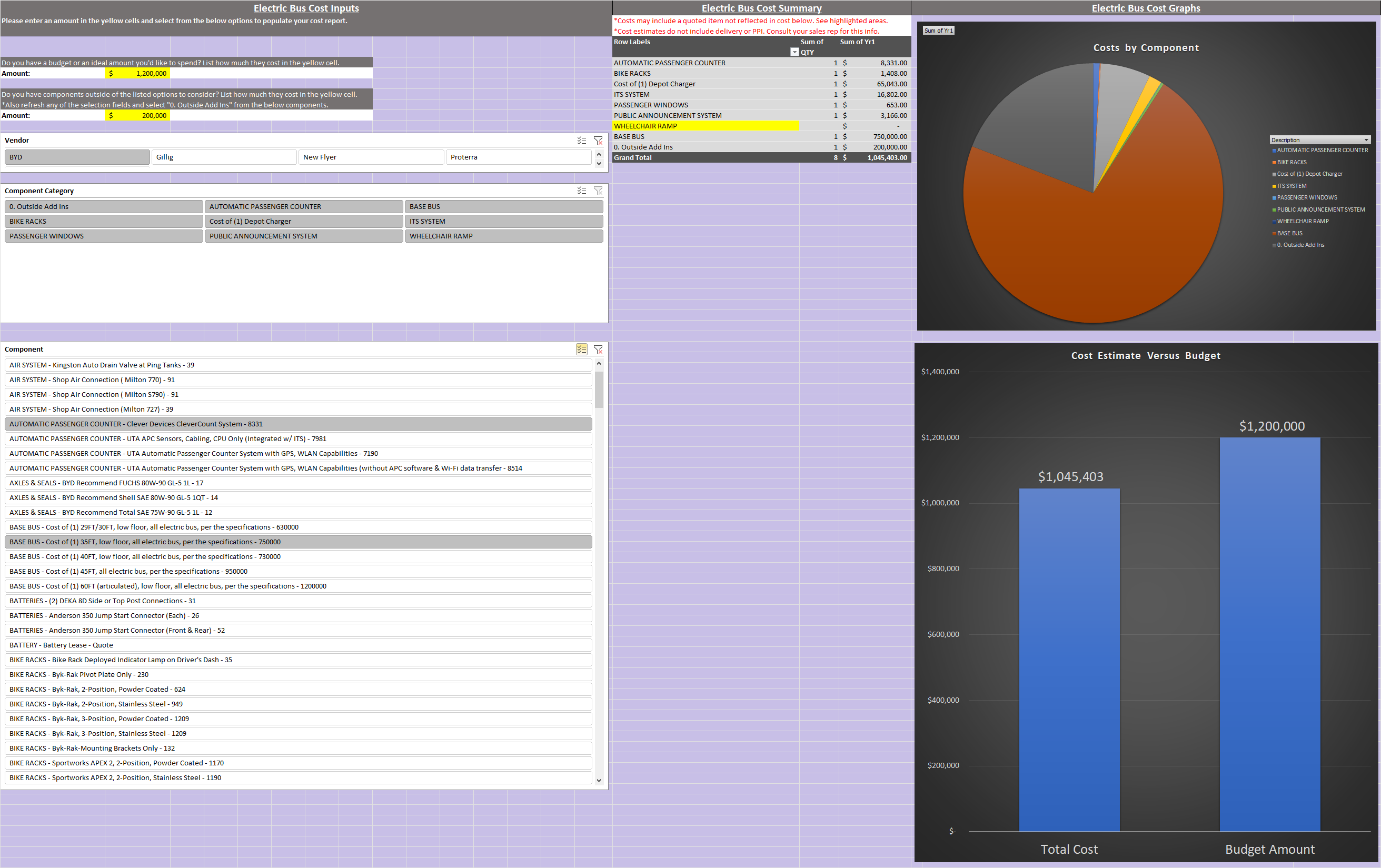
This dashboard in particular is to cost out an electric bus. There are 4 options for different vendors and each vendor has a unique list of options you can add to your electric bus purchase. It asks for a budget amount too so you can see visually what it cost's relative to your allowed spend amount. Also it displays a pie chart showing the user what the biggest costs are in relation to their purchase. Below is an example of what this all looks like. Ideally this helps the people in management purchasing electric vehicles to decide what they can afford to spend quicker than doing this by hand.
Link to a great Youtube tutorial for more on how to make something similar.